Video credit: UKRI
Video transcript and on-screen captions are available by watching on YouTube.
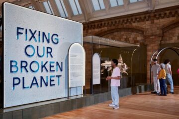
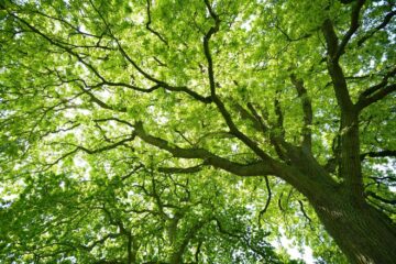
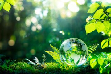
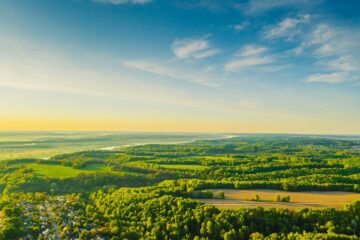
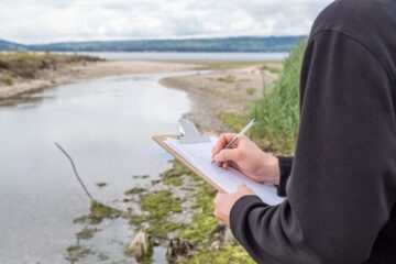
Worldwide, people are working hard to understand how we can live sustainably on our planet.
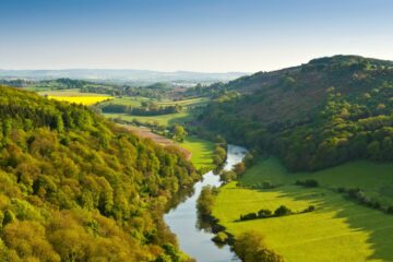
Future generations are depending on us to grow and spread prosperity while protecting biodiversity and natural resources.
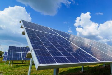
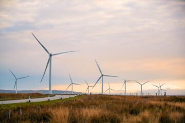
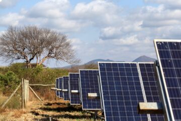
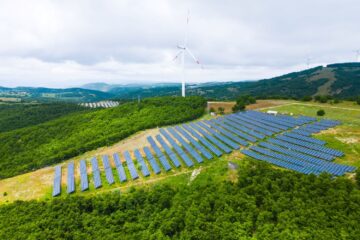
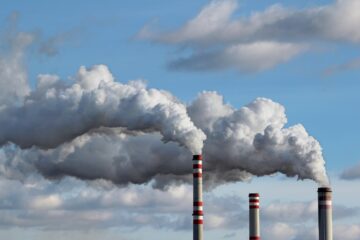
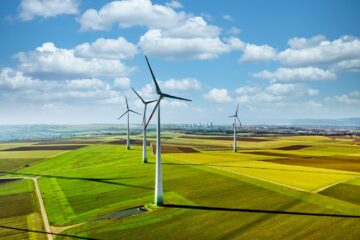
Through this strategic theme, we are working to limit and adapt to climate change by:
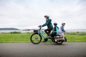
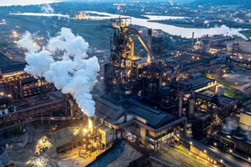
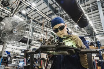
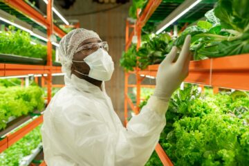
- reducing the demand for carbon-intensive activities in areas such as agriculture, transport and construction
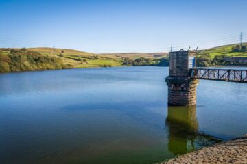
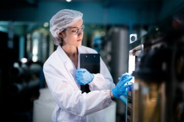
- increasing the sustainability and resilience of public services and infrastructure
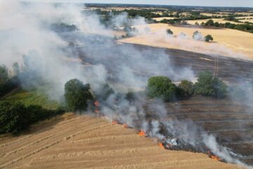
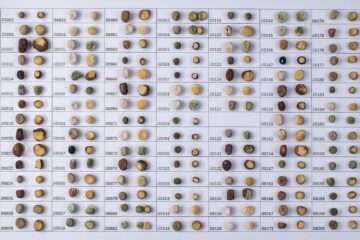
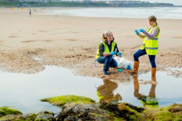
- protecting biodiversity and reducing waste
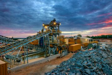
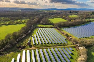
- growing the green economy evenly across the UK
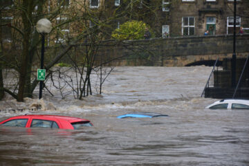
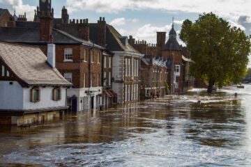
The UK has committed to reach net zero carbon emissions by 2050. This is driving policymakers and organisations to find and unlock new solutions.
Climate change will fundamentally shape our future so we all have a role to play in managing its impact while sharing resources fairly.
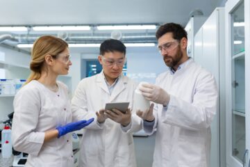
By working together and understanding complexity, we have the opportunity to develop new technologies, grow new businesses and jobs and protect our precious world.
Find out more about our new work, investments and funding opportunities in building a green future.